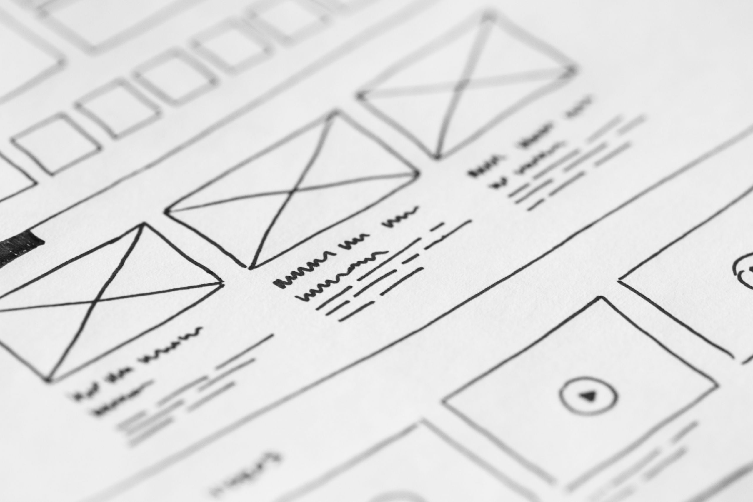
Your business needs a website. But your business needs a website that has a well-thought user-experience to give you the momentum you need.
Why?
Your website can look stunning, share excitement but not have any thought to user-experience, which is essentially a pain-point for potential customers.
Ask yourself. How many of the questions below would my customers ask?
1. What do these guys actually do?
Ensure your site isn’t vague. You have the first three seconds of the page loading to give your potential customers a feel for the service or type of product your business provides. Visuals like images and icons can communicate this and colours can influence the way your business’ website feels. Seek inspiration from competitors and ensure you’re giving away exactly what you do/sell the moment someone lands on your page.
2. How do I go back to {…}
Even heard of intuitive navigation? This is essential to smooth sailing user experience. Whilst your potential customer is clicking around your website, you’ll want them to understand where they are and how they can get to the place they want to be. Make sure your customers don’t get lost and confused on your website. If they can’t return to something they were previously looking at, they’ll immediately be frustrated. This can be achieved through breadcrumb navigation or a static hamburger menu which is always accessible.
What is Breadcrumb navigation? A breadcrumb or breadcrumb trail is a graphical control element frequently used as a navigational aid in user interfaces and on web pages. It allows users to keep track and maintain awareness of their locations within programs, documents, or websites.
What is a Hamburger Menu? The hamburger button, so named for its unintentional resemblance to a hamburger, is a button typically placed in a top corner of a graphical user interface. Its function is to toggle a menu or navigation bar between being collapsed behind the button or displayed on the screen. Source
3. Am I still on the same site?
Design consistency is key here. You don’t want a crisp white homepage and then a clunky brown about us page. This also applies to the way the website functions. Each page should speak to one another and by mastering this functionality, a user is more likely to stay on your site.
4. Where do I click to get this?
This one’s kind of a no brainer. If you’re advertising a free download or a new article, make it easy to access. The path for the user to follow or convert should be super easy to find. Really…it should be impossible for them to miss.
5. Would this be easier to do on my computer?
As society becomes increasingly more mobile, more and more potential customers will be viewing your website through their mobile screens. This question should never cross your potential customers mind. Mobile and tablet experience is crucial to any business. The experience should be just as seamless as a computer experience.
So, how many of these five questions do you think your customers have asked whilst on your website?
At Web Bird Digital, we can help you understand exactly how to design and develop a seamless user experience. We’ll work with you on streamlining the experience by tapping into the user’s perspective.
You can learn more about our web design agency‘s passion for websites, intuitive design and taking your business online by visiting our About Us page.


